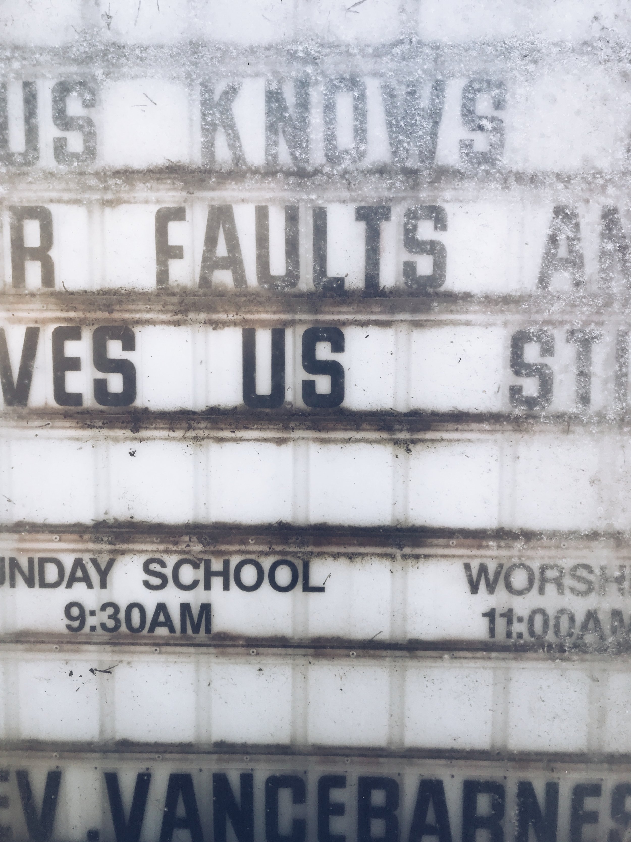
Now Open Between Easter and Christmas

Photo by Damon Lam on Unsplash
A congregation in the town next to ours has a new main outdoor sign. Recently the sign said, “Now open between Easter and Christmas.” I wondered what they meant by the phrase and why they used it?
Yes, I know it is a common advertising phrase, “Beth’s bookstore now open in Bethlehem,” for example, but I wonder why a congregation would use these words as words of welcome.
They do not sound welcoming to me.
To whom are these words addressed? To those who do not attend worship except on Easter and Christmas so they might feel guilty and come to worship? To those who do attend worship regularly so they might feel smug because they do attend worship between Easter and Christmas?
If not these words, what information should be on a congregation’s main outdoor sign?
Before answering that question, it is important to understand to whom a congregation’s signage is addressed. Not active congregation members – they already know the information on most signage. Instead, a congregation’s main outdoor sign should address those who are not in worship, who may have never been in worship at your congregation or any congregation for that matter.
The information on that sign should be simple – as simple as your worship time: “Worship on Sunday, 9 am.” This basic information should be in the largest type size that fits on your sign.
Try this – drive by your congregation at the speed limit and ask your passenger to read your sign. If the speed limit is 35 miles per hour (and we know most folks drive above the speed limit at least a little), then the sign type size should be 6 inches high or larger.
Keep your signage basic – no inside language or churchy terms, such as “Praise time, 9 am” or “Nave, 10 am.”
If you have another line space available, a simple “Welcome” or “Everyone is welcome” is nice. That is assuming, of course, that everyone is indeed welcome!
What else should go on this sign? The worship time in large print is enough, but if you have more space, you could add the education opportunities for children and adults.
If you have more space, you could add the congregation’s website but only if it isn’t too long. “Trinity.org” works, but anything with initials instead of words or longer than 15 or 20 characters will be just too hard to remember (as you drive by at 35 miles per hour).
No need to list the pastor’s name on your sign – that’s not what people driving or walking by are looking for. No need for catchy phrases, either, especially ones that could be read as a put down. It is all about keeping it simple, straight forward and most importantly, welcoming.
A congregation’s signage can be an effective way to invite someone into your church building for the very first time if done well. Talk it over with your church leadership.
And now, I need to go find that new bookstore in Bethlehem, (Pennsylvania).
The Rev. Eric C. Shafer
The Rev. Eric C. Shafer is Pastor-in-Residence for Lutheran Immigration and Refugee Service. He has taught basics of church communication across the ELCA including seminars at all ELCA seminaries and at seminaries in Madagascar and South Africa.
This article originally appeared on the Church Anew website.
